Blast Off Origins (October to December 2020).
- eveb81
- Apr 30, 2021
- 13 min read
Updated: May 7, 2021
October 2020 to December 2020.
October:
(Notes from: 26.04.21)
As I hadn't started this blog till March this year (2021) these notes will be from my memory and animation journal . I have done my best to recall key information however, these event's will not be 100%.
When this " * " icon appears I am writing from memory.
The Idea:
14.04.2013

In 2013 I was studying my Film and Animation Degree at the University of East London when I came up with this simple 1 minute animation of a space shuttle about to take off and then after all the smoke from the launch clears away it's still sitting on the launch pad. After a moment it the falls over like an empty tin can.
The setting's had simple iconic images: NASA style space company, Flags, Times Square and crowds of people. All these would be cut back and forth with the launch.
*
Over all this was an interesting concept that I thumbnail sketched and then forgot about.
It wasn't until 2020 when I started my Masters Animation VFX at Dundee University that I rediscover it in an old sketchbook and developed it into the main project for my Advanced Production Module.
Since the decision was made to use this as my main project I have extended and altered the idea to be from 1 minute 30 seconds to 2 minutes. I have also chosen to develop the assets and environments in Maya with Graphics created in Illustrator the will then be taken into After Effects and developed into Motion Graphic.
This will be quite a challenge for my next year since I have never used Maya or After Effects before and have only a very limited experience with Adobe Illustrator and Premier.
Notes: Well that's the plan at the moment. (February 2020)
Research and Investigations:
30.10.20
These are some preliminary images of space ships.

Lead Asset:
Most rocket ships seem to have a similar design with the exception of the Axiom which is in Wall-E and isn't really a rocket ship but more of a city in space. Also the shuttle from Wallace and Gromit "A Grand Day Out" is almost a replica of Wallace's house.
I'll be keeping with a "classic" look for my space ship.
A cone shaped design which is going to maintain an element of reality. The shuttle must be supported by a launch tower structure or support system like in some of the photos pictured.
30.10.20

Lead Environment:
The Launch Control Room will play a very important part within the film. I have taken inspiration from the main control room at NASA as well as other control rooms such as in Nuclear Control rooms and Missile Testing launch rooms.
The screens will be the source and destination of the Motion Graphics and re-enforce the science fiction theme running throughout the animation.
30.10.21

Motion Graphics:
In the lunch room there will be computers, display screens and keyboards for inputting information. This is some research and general investigations images that might be needed in the final film.
Colour can be a great source and speak volumes without saying words, mixed with the motion graphics I hope it can convey key information. Old colour screens used main green however, blue and white were also available. It might be a good idea to test out different colours to see what
31.10.20
Touch Table Examples:
I've fallen in love with the idea of incorporating a touch table into this animation. Overall the action of pushing a solid surface and having a reaction from it on another screen can be a really quick, efficient and useful way of doing things. It's not all about short cuts because it also looks incredibly futuristic. This will also be a source for sound effects and that will also add a new dimension to the whole animation as I haven't thought much about sound and nosies are free and come with no copy right infringement.
A few examples of really effective touch tables and tablets are: Star Trek (the original and subsequent series and spin offs) as well as films like Quantum of Solace (2008), Total Recall (2012), Oblivion (2013) and The Marvel Avengers Franchise (2008 -2020).


This is to give a few examples however, many more exist and touch tables have become really popular in recent years with Museums and at interactive events.

This example is comes from Quantum of Solace (2008)
31.10.20
Some images and research into what a touch table might look like and things to have.

List of things to have on the touch table:
A keypad/board theoks like a circuit schematic
Code Screen 1
Code Screen 2
Touch buttons
Hand or thumb scanner
Authorise button and
Projection pad
31.10.21
Around this time the my lecturer introduced me to the Google Style. This mid-century modernist style will look amazing with the themes of what I am hoping to achieve with the animation.
After doing some investigations into the movement I really feel like this is the right direction to be going in. I've fallen love with the look and style. I really feel that it needs to be incorporated into the overall look of the project.
I am now really interested in having this mid-century modernist Googie inspired look with the themes, colours and styles.

The Googie Style started around 1945 in California, USA. It's bold and bright, classic stylised Americana with a generous helpings of 1950's and 60's science fiction elements.
Trying to image this era is difficult. Computers fit into whole rooms and could do only the most rudimentary actions and the world was discovering space and going to the moon.
*
At this point in the process I can remember that I was working on the story of this animation.I was trying to develop it with storyboarding and I was struggling.
The original animation was supposed to be 1 minute long. A quick action story with a final end punch line originally written 7 years ago. The changes that I made shouldn't have made a big impact however, something seemed off and unable to cohesively connect.
I remember at this time my lecturer, Kieran, mentioning the Goblins short "Pyrats" from 2006 and others. This animation is similar to the overall desire I had for mine.
Sitting at 1 minute 30 seconds this traditional animation is packed full of action, character and drama and it has a really good twist ending. Watching it a few times and investigating other similar ones has helped me refocus my energy and re-discover the original passion I had for the project.
* continued...
Notes about the Ending:
In the original idea the space shuttle is attempting to liftoff the launch pad.
This seemed like a successful outcome with lots of smoke and sparks flying around and everyone in the launch room cheering, everyone in the street cheering, the bars cheering and the homes of the regular family cheering and then cut back to the shuttle and it's still sitting there.
However, there was a lack in depth with it. It's fine to go for the easy big impact and punch line option but, I want to have something that's long lasting and displays a deeper meaning.
Maybe plain or silent or something with complete stillness before moving into one fluid dramatic moment "twist" ending they didn't see coming. Something that grabs the audience holds them, makes them laugh, cry and
carry around with them for years to come.
I endeavour to continue on with my research and development in an attempt to find this moment.
Orignal Journal Notes:


November:
(Notes from: 26.04.21)
As I hadn't started this blog till March this year (2021) these notes will be from my memory and animation journal . I have done my best to recall key information however, these event's will not be 100%.
When this " * " icon appears I am writing from memory.
2.11.20

More on the Googie Style:
Architecture and the jet age. Taking insperation from the drive thru culture that originated in America's California culture between the 1950's and 1960's.
The architectural style championed by John Lautner, a student of Frank Loyd Wright and Allan Hess.
Extravagance and Exaggeration were key features. Most notable elements included cantilevered roofs, bold colours and geometric shapes. The idea was that Form equaled Function.
The style was unable to adapt it was short-lived and only a few examples existing in modern day.
Most recognisable examples include:
LAX Airport in Los Angeles.

The Las Vegas Welcome Sign.

The First MacDonalds Restaurant.

02.11.20
*
Another area of my research let to investigate animations of the 50's and 60's and was really inspired by the cartoons of Warner Bros, UPA and the world of Hanna-Barbera.

The Jetsons
Thunderbirds
UPA cartoons:
Gerald McBoing Boing and The Jaywalker
Charlie Brown
Yogie Bear and
Top Cat
To name a few, all these prosuctions embraced stylised concepts and themes to portray a constant look/feel of the 50's and 60's era that they were made in.
Personally I love the sharpness. The simplicity. The boldness.
While these cartoons embodied the era they were made the style has come back into fashion more recently and found in more recent cartoons and films such as:
The Incredibles (2004):

Kim Possible (2002 - 2007):

A Wee Note about Environment:

I have always been interested in environment design and background and how it interacts with the action that takes place in front of it and along with it.
I don't know much about environment design but, it is something I hope to investigate more over the next year and into the future and how it works within the industry.
*
4.11.20
At this time I remember that I felt like I needed to write a script for the project and produce a storyboard for the idea as it is at present.
I began writing a script to try and flesh out the story and work on a lead character. I had never written an animation script before so I had to do some research into the differences between Film Scripts and Animation scripts.
The only main difference between the two is that an animation script needs to have scenes described more than a Live Action Script.
See the examples below for comparison.
Ratatouille (2008)
and
The Godfather (1972)
A Section from the first draft of the script:
Ambient nosie from the launch room can be heard in the background
Launch Controller - "Give me a go no go for launch"
Ambient noise can be heard in the space shuttle
Flight - "We are go for launch"
Ambient nosie from the launch room can be heard in the background
Launch Contoroller - "We are a go for launch. I say again we are a 'go' for launch"
Ambient nosie from the launch room can be heard in the background
Launch Controller - "Countdown ignition sequence start 10 - 9 - 8 - 7 - 6 - 5 - 4 -3 - 2 - 1."
In-between frames of the shuttle, the launch controller, launch room, people in the street, people in there homes and crowds in the cheer and shout in excitement
A small side note is that this reminds me a lot of Apollo 13 (1995)
Notes: I was hoping for a more unique idea.
06.11.20
Frame Examples:


*
November 2020.
At this time I became aware of a company called DUST.
A film company specialising in sci-fi entertainment working "with established and emerging voices" through feature films, short films, series and podcasts. It's current library contains over 400 stories.
This company has some of the highest qauilty productions I have seen in recent years. Every new story is one I wish I'd thought of. It's a gem if you're into sci-fi or interesting and engaging stories.
12.11.20

While I was discovering DUST I also found these story cards from a company in Glasgow called Play Dead TV.
The project was in collaboration with a Big Mouth Audio to create 8 story cards for an audio Once Upon A Time In Zombieville a comic based on a boy who moves to a small town on the East coast of America with his father.
I really loved the idea of these story cards and I wanted to understand them better so I could maybe use them in my project.
*
At this time I started thinking that maybe my space shuttle didn't need to be based on Earth. That maybe it was another planet and that could be a bigger twist. I was still struggling with the whole idea and concept of the story while I was researching and then I started thinking about making my lead character, the Astronaut, inside the space ship and how he might be either thinking about leaving his home or trying to get home.
23.11.20

This led me to think about all those movies I've seen over the years which contained themes surrounding or directly about home.
Conclusion was that they're a lot more of them around, a lot more than I had remember and they can be found in every genre of fiction.
*
23.011.20
Thinking specially about Planet 51 (2009), in relation to my project, the main character, an astronaut, goes on a mission to concur planet 51 and finds that alines already live there and very closely resemble humans, with a few differences.
Other examples of this idea include:
Home (2015)

Escape from Planet Earth (2013)

24.11.20
In May 2020, during the first lockdown, I joined a writing community. I have always written creatively in my spare time and I wanted build this into a constant hobby and I found this time to be a great opportunity. A search on line highlighted a fantastic writing community where I could get a wide range of incredible constructive crtitisim from people all over the world with a similar desire to my own.
To be honest and constrictive in a positive manner.
I honestly don't know why I didn't do it sooner.
As a writer I have always been a panster, someone who - is the type of writer writing on the fly, without an outline or roadmap for the plot - over a potter. This can be difficult as you let the story lead you and go where it feel natural. No matter how far away from the original version needed you must ride the wave with an open mind.
This can often lead anxiety over where and what the story you are writing is about and at this point in time I remember that I did feel very anxious about not having a set plot, story or concrete idea to work towards. Time was moving fast in semester 1 and it was almost the hand but, we must "trust the process" as they say at PIXAR.
Writing this as flash fiction seemed the best idea at this time because I didn't want to get bogged down in a short story which can be up to 5,000 words.

24.11.21
Cameron:
Liked - The opening and the language as it made it less poetic but, in a good way. That the Astronaut was not the "chosen one"
Questioned? The use of time and wonders what it represents
Disliked - liked the city scene
Heather:
Liked - The detailed and the descriptions and the end sentence as it remained her of Interstellar (2014) as it was about bending time and space.
Notes: I'll need to watch it and see if it helps with my project.
26.11.21
Comments from my writing group.


26.11.20

I love the colours of the Googie movement they seem to contrast and complement each other at the same time, even without the neon effects they seem to shine and leap off the screen. I hope to use these colours in my final project and I will investigate them further down the line. If my plans don't change.


Typeface: Fontdiner.dot.com

30.11.20

In my original story, way back in 2013 the shuttle design was always going to be based on my Lava Lamp.
This Lava Lamp.
Despite having it for a long time I'm still in love with the shape. It has the retro feel that is needed for the concept. I love the simple curve of the design. It even looks like it's taking off when the lava warms up.
In the dark, with the light off, it even looks a little alien and the hot lava is floating around.
*
It was around this time that I felt that I really had to start nailing down the specifics of the project. However, this wasn't easy as I couldn't get a strong enough grasp on the story or idea. Something was missing or out of place and I knew that forcing the answer was never going to be the right decision.
I'd learned the during the second year of my degree with another project that wasn't going to work and forcing an answer wasn't the way to go about it because that would more than anything force the project further in the wrong direction.
In the end I did only what could be done; I stopped thinking about the project, well for the next few weeks anyway and decided to focus on the submission deadline that was looming in the near future.
Orignal Journal Notes:


December:
(Notes from: 26.04.21)
As I hadn't started this blog till March this year (2021) these notes will be from my memory and animation journal . I have done my best to recall key information however, these event's will not be 100%.
When this " * " icon appears I am writing from memory.
POSTER
*
I had no experience with Illustrator before I began my MSc in October so I used the poster submission as an excuse to produce a 1950/60's style graphic design that matched the theme of the essay which was about the work ethics of Animation companies in California, USA from the 1940's and comparing them with today's standards.
Poster Research:


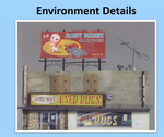


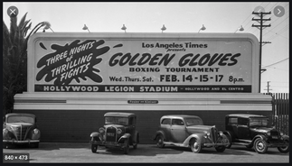


Overall Billboard and Fence Designs:


Final Overall Poster Assets:
These are some of the assets that I created for the poster. I'm really proud of the Disney Castle and the Plane and I also like "Figure 3" that came out nicely too.

Final Overall Poster:
This is the overall poster that was submitted. If it was printed it would be A1 size and while it is overloaded I still love the way it looks and how it turned out in the end. If there wasn't as much information then I think it would have a better balance.

Round Up of Semester 1: 26/04/2020
(written from journal notes on 11/12/20 and experiences over the last five months)
Usually before a hand in or a project comes to conclusion I head off for a few hours and go somewhere where no one knows me and sit with my journal to write up everything that's happened over the last few months. I find that this really helps focus my mind on what has happened and what I have learned.
Mostly there was a lot of stress related to this semester. Due to forces out with my control, COVID 19, receiving my computer 7 weeks after the start of the Masters and that made me 7 weeks behind learning: Maya, Zbrush and Adobe.
I think that's why I used my poster as an excuse to learn Illustrator. It was a great way to get to know the program and some of the features. Even now five months later I'm still discovering new tools. The eye dropper is the most recent one thanks to the Going Live project. Emma's colours were so vivid and I didn't want to eyeball something that might be in the right RGB area.
From semester 1 I also found the written work difficult since I did not live in Dundee, not even close I couldn't access the library in a physical way. I don't know about anyone else, maybe it's me but, having the book you need in your hand makes the information stick a lot more than reading it off a screen.
I know I'm not alone in this but, for me when I study I like to be in the library or the lab, working with people, interacting with people. Even the virtual class room isn't that great because you can't see what everyone is doing, you only see faces, not even what they're working on.
Working over Teams is interesting and challenging and I've realised that I'm not the best suited to the arrangement. All I can say is that it was an interesting and at times frustrating experience when the Going Live project started. Things seemed to take longer than they normally would. I am getting to grips with it and I am improving but, it's difficult but, I am improving.
Orignal Journal Notes:


Notes from January 2021 onwards can be found in the Blastoff Project blog.


Comments